
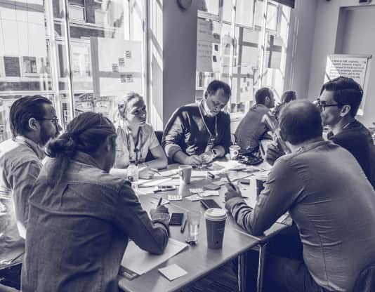
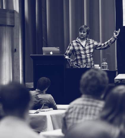
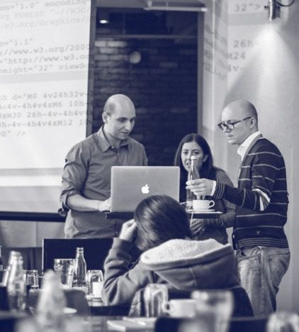
Workshops
Roadmapping Your Product Roadmap
Ask 10 people what a product roadmap is and you will get 10 different answers! This artifact is an often misunderstood component of product development, but an incredibly important one to get right. Creating a great one is part art and part science. In this session we will talk through the real purpose of a roadmap and how it can be used to get the most out of your project and team. We'll unpack the key steps in the process such as product visioning, themes, prioritization and stakeholder buy-in and alignment as well as and shed some light on the tools and frameworks that can be used to ensure a successful roadmapping effort.
Ask 10 people what a product roadmap is and you will get 10 different answers! This artifact is an often misunderstood component of product development, but an incredibly important one to get right. Creating a great one is part art and part science. In this session we will talk through the real purpose of a roadmap and how it can be used to get the most out of your project and team. We'll unpack the key steps in the process such as product visioning, themes, prioritization and stakeholder buy-in and alignment as well as and shed some light on the tools and frameworks that can be used to ensure a successful roadmapping effort.

The Front-End Espresso Shot
CSS has seen a lot of new feature releases in the last few years. Keeping up with everything can sometimes be overwhelming. It’s even harder for many designers and developers to ditch the tools and frameworks they’re already familiar with and relying on, in favor of new, native “frameworks” with a less than familiar syntax. But doing so is the way forward. CSS’s native features like Flexbox and Grid as well as CSS Variables provide a lot more power and flexibility than any previous frameworks or tools did—power than we should embrace and put to good use today moving forward.
In this workshop, we will cover a range of topics from SVG usage as an image system to CSS features, building progressively enhanced page layouts with the newest CSS layout techniques, creating truly scalable, responsive typography, theming using CSS Variables, and creative visual effects using CSS transformations, blend modes and filters, and making sure our components have at least the minimum level of accessibility.
Attendees will walk away with knowledge they can apply right away, including:
Creating creative page layouts with the new CSS Grid framework.
Component-level layout enhancements using CSS Flexbox.
Using CSS’s native feature detection @supports to leverage the new layout techniques, all the while providing basic fallback for non-supporting browsers.
Using CSS custom properties to create and support multiple themes, including providing an accessible theme for less accessible designs.
Using math in CSS to create scalable, responsive typography for our responsive designs: CSS viewport and relative units inside calc().
Using CSS transforms and shapes to break out of the box and create creative, non-rectangular layouts.
Make peace with the occasional responsible usage of CSS hacks, without compromising the accessibility of the user interface.
Implementing SVGs in a responsive workflow, including basic icon animations.
Enhancing and styling UI elements (such as form elements) accessibly and using animated SVGs.
Learn how to use SVG to display, style and apply powerful image effects to other image formats!
Strong focus on semantics and accessibility using ARIA roles and attributes where needed.
Learning how all the new CSS features open up more flexible possibilities for designing and making decisions in the browser.
We'll also be getting an overview of CSS graphical effects such as filters and blend modes, allowing us to give our designs that extra punch, making design and experimenting in the browser more accessible to us.
Attendees will be challenged with a series of creative exercises, implying all the above techniques to solve real-world design challenges.
Satisfaction guaranteed.
Atomic Design: Patterns and Principles
Style guides, design systems, and pattern libraries provide solid ground for us to stand on as we tackle the increasingly diverse and fast-moving web landscape. This full-day session will tackle all that goes into making and maintaining successful interface design systems, including:
Atomic Design Principles
We’ll cover core principles of modular UI interface design and discuss considerations around atomic design, a methodology for crafting robust, deliberate design systems.
Selling Design Systems
We all know design systems and pattern libraries are great, but how do you get your clients, bosses, and teammates on board? We’ll cover tactics and tools for selling pattern libraries to clients and stakeholders, and detail how to create an interface inventory to pave the way for style guide success.
A Pattern-Based Process
Making modular interfaces requires massive shifts in our design and development process. We’ll discuss why front-end development is an essential part of the design process and demonstrate how tools like lo-fi sketches, style tiles, element collages, Pattern Lab, and others facilitate collaboration—and result in successful design systems.
Style Guide Maintenance
Like a fine wine, a design system increases in value over time. We’ll discuss tactics and techniques to ensure that your pattern library stays in sync, and your design system provides lasting value to your organization.
UI Patterns
Creating modular interfaces is challenging, but thankfully the web community is hard at work creating flexible, downright innovative UI design patterns. We’ll look at patterns for tackling layout, navigation, images, data tables, and really anything else you can include in an interface.
By the end of the day, you’ll be armed with all the insights and resources you need to create, sell, and maintain effective interface design systems.
Responsive Interface Design Bootcamp
Are you ready for a design challenge? In this brand new workshop, Vitaly Friedman, editor-in-chief and co-founder of Smashing Magazine, will be taking a microscopic examination of common interface components and problems appearing in responsive user interfaces. In this workshop, we’ll be spending an entire day drawing and designing responsive interfaces, starting from accordions, to date/time pickers, sliders, feature comparisons, car configurators all the way to insurance calculators and trip planners.
The workshop is intended for intermediate/advanced designers and developers who have an understanding of responsive design and how it works.
Most techniques are borrowed from mid-size and large-scale real-life projects, such as large eCommerce projects, online magazines and web applications. We won't cover the basics, instead, the workshop covers more advanced — and often obscure and innovative techniques.
What will the workshop cover?
In this workshop, we’ll go hands-on into exploring:
Responsive art direction techniques and advanced layouts, with many inspiring and memorable examples,
Navigation, with mega-drop-downs, breadcrumbs, carousels, accordion and filters,
Builders, with a car configurator and mobile plan builder,
Forms, with email verification, password input, country selector, privacy issues, sliders and public transportation, and a banking transaction UI,
Date pickers, date range picker and a time picker, incl. booking an appointment and booking an airline ticket,
Tables, with a feature comparison table, currency exchange calculator, pricing plans,
Search, with autocomplete, filters, search results,
Calendars, with a multi-track schedule, TV Guide schedule, music festival schedule, exhibition calendar, spreadsheets and dashboard,
Audio/Video, with a video player UI and audio-based input,
Maps / Data Visualization, with a shopping mall map, election map, smart region input.
Timelines, with a historical timelines, soccer game signature and live leaderboard and standings,
Real-time experience with betting UI for soccer, poker and live video streaming,
Footnotes and sidenotes in magazine articles,
Seat selection, for a concert/theatre/exhibition and a perfect airplane check-in,
Responsive PDF for documents and restaurant menus,
Responsive upscaling, with eCommerce experience on large screens and article layout on large screens,
Design anti-patterns to avoid to prevent running into maintenance issues and “slow UX decay”.
What hardware/software do you need?
You'll need to bring a lot of creativity with your preferred coffee mug. We’ll be spending a lot of time drawing, sketching, designing and thinking. Laptop is preferred but not absolutely necessary. You’ll need a lot of sleep reserves since it’s going to be a packed day. Bring a lot of attention to detail and non-standard thinking to this one! ;-)
We have prepared a program with activities that will get you to know better the beautiful north of Portugal. Between Braga and Porto you will have time to explore in the days before and after the conference.